
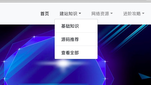
最简单的Bootstrap4 Dropdown鼠标点击改为鼠标悬停触发
10th April, 2020
控制滚动轴的7个伪元素分别是:
::-webkit-scrollbar:整个滚动条
::-webkit-scrollbar-button:滚动条上的按钮(下下箭头)
::-webkit-scrollbar-thumb:滚动条上的滚动滑块
::-webkit-scrollbar-track:滚动条轨道
::-webkit-scrollbar-track-piece:滚动条没有滑块的轨道部分
::-webkit-scrollbar-corner:当同时有垂直和水平滚动条时交汇的部分
::-webkit-resizer:某些元素的交汇部分的部分样式(类似textarea的可拖动按钮)
::-webkit-scrollbar{
    padding-left:1px;
    background-color:#fafafa;
    overflow:visible;
    width:9px;}::-webkit-scrollbar-thumb{
    background-color:rgba(0, 0, 0, .1);
    background-clip:padding-box;
    border-left-width:2px;
    min-height:10px;
    box-shadow:inset 1px 1px 0 rgba(0, 0, 0, .1),inset 0 -1px 0 rgba(0, 0, 0, .07);}::-webkit-scrollbar-thumb:vertical:hover{
    background-color:rgba(0, 0, 0, .2);}::-webkit-scrollbar-thumb:vertical:active{
    background-color:rgba(0, 0, 0, .2);}::-webkit-scrollbar-button{
    height:0;
    width:0;}::-webkit-scrollbar-track{
    background-clip:padding-box;
    border:solid transparent;
    border-width:0 0 0 2px;}::-webkit-scrollbar-corner{
    background:transparent;}::-webkit-scrollbar-track-piece{margin: 10px 0;-webkit-border-radius: 0;-webkit-border-bottom-right-radius: 4px;-webkit-border-bottom-left-radius: 4px;}
浅蓝色美化效果推荐:
::-webkit-scrollbar{
    overflow: visible;
    width: 10px;
    height:10px;}::-webkit-scrollbar-thumb{
    min-height: 10px;
    border-radius: 5px;}::-webkit-scrollbar-corner {
    background: transparent;}::-webkit-scrollbar-track-piece{
    margin: 10px 0;
    border-radius: 5px;}::-webkit-scrollbar {
    background-color: #eaebef;}::-webkit-scrollbar-thumb {
    background-color: #a8cbe9;}::-webkit-scrollbar-thumb:vertical:hover{
    background-color: #8fc2ed;}::-webkit-scrollbar-thumb:vertical:active{
    background-color:#8fc2ed;}
::selection {background: #ff0;}
将上面代码放到你的css中就可以了。
上一篇:最简单的Bootstrap4 Dropdown鼠标点击改为鼠标悬停触发
下一篇:没有了!

11th August 2020
1st May 2020
28th April 2020
28th April 2020
26th April 2020
21st April 2020